28.8.2023 - 9.12.2023 (Week 1 - 15) Lew Se Win / 0347637 / Bachelor
of Design (Hons) in Creative Media Major Project TravelBliss
Week 1 - Brainstorming Idea
Upon returning from my exchange program in the UK, I discovered a profound
passion for travel, and as I explored various destinations between the end of
the UK semester and the commencement of my studies at Taylor's University in
Malaysia, I realised that traveling enhances my perspective, cultivates
cultural understanding, and facilitates personal growth through exposure to
diverse landscapes, people, and experiences; I am deeply appreciative of this
opportunity and thoroughly enjoy the enriching experiences of travel. With
that, my first idea to work with my major project would be around the topic of
travel.
When thinking about the problems travellers face, I initially thought of
making a centralised travel app for everything to make a traveler's life
easier. But I learned that wouldn't work because there are so many different
travel services out there. It makes sense because there are a lot of
companies providing travel services.
Another problem I noticed as a traveller is that planning trips with friends
can be confusing. There's no one place to share travel plans, and going
through everyone's experiences can be a bit of a hassle. So, the main issue
I see is the complex travel itinerary planning.
With that, I decided to work on this identified problem by also starting to
research for existing travel mobile applications in the market.
This week, I conducted contextual research by performing a competitor
analysis on a few existing travel apps in the market.
1. Trip Advisor
Trip Advisor is the world's largest travel guidance platform. It provide
travel booking services and provides reviews, ratings, and information about
various travel-related services, such as hotels, restaurants, and
attractions.
Figure 3.1 TripAdvisor analysis
2. Booking.com
Booking.com is a prominent online travel agency that facilitates hotel
reservations and offers a wide range of accommodation options
worldwide.
Figure 3.2 Booking.com analysis
3. Expedia
Expedia is a well-known online travel agency that also provides a platform for
booking flights, hotels, rental cars, and vacation packages.
Figure 3.3 Expedia analysis
4. Trotter it
Trotter it is a travel journal app that allow travellers to journal their
trips.
Figure 3.4 Trotter it analysis
5. Trip it
TripIt is a travel management app that helps users organise their travel
plans in one place.
Figure 3.5 Trip it analysis
Week 4 & 5 - Research
I decided to conduct interviews and distribute a survey questionnaire
because I want to understand the problems faced by travellers. I began by
structuring the interview questions to grasp their struggles and needs.
Interview Questions: 1. Background and Travel Habits: a. Can you tell us a bit about your travel background? How
often do you travel? b. What types of
trips do you typically take (e.g., leisure, business, adventure, family
vacations)? c. Do you usually travel
solo, with friends, family, or as part of a group?
2. Travel Planning:
a. Could you describe how do you currently
plan your trips and itineraries?
b. What tools or apps do you use during
the planning process?
c. What are the most challenging aspects
of trip planning for you?
3. Pain Points and Frustrations:
a. What frustrations have you encountered
when planning or during your travels?
b. Are there specific challenges you face,
such as finding budget-friendly accommodations, managing itineraries, or
dealing with language barriers?
4. Information and Research:
a. Where do you typically go to research
and gather information about your travel destinations and travel tips?
b. How important is it for you to access
detailed information about a destination's attractions, culture, and
safety?
5. Personalisation and Recommendations:
a. Would you appreciate personalised
travel recommendations based on your interests and travel history?
b. How valuable is it to receive tailored
suggestions for activities, dining, and destinations?
6. Mobile App Usage:
a, Do you frequently use travel-related
mobile apps and technology for navigation, communication, and finding
activities during your trips, and if so, are you comfortable using them?
b. Are there specific technological
features or integrations you'd like to see in a travel app?
7. Community and Social Interaction:
a. Do you like connecting with fellow
travellers or locals while on a trip?
b. Would you be interested in features
that facilitate communication and networking with other travellers?
8. Pain Points Specific to Your Travel Style:
a. If you have a particular travel
preference or style (such as adventure, luxury, or family travel), what
distinct challenges do you encounter, and how do you envision an app
addressing these challenges from your perspective?
9. Post-Trip Engagement:
a. What do you typically do with your
travel photos, memories, and recommendations after a trip?
b. Would you be interested in sharing your
travel experiences within a travel app community?
10. Overall Travel App Opinion:
a. Do you oppose using a specific app to
promote travel information? If yes, what are your concerns?
I sent the list of questions out through email to a total of 8
interviewees.
While preparing the research, Mr. Razif also advised me to create a business
model canvas to present my app idea.
Figure 4.0 TravelBliss BMC
Later on, I created a questionnaire to conduct quantitative survey as the
responses from email are limited.
Figure 4.1 Survey Questionnaire
Week 6 - Data Analysis & Define
After collecting all the data, I analyze the collected data.
Figure 6.0 Data Analysis
From all the data analysis, I could out with 4 insights statement which lead me to the ideation and creation of the upcoming app.
Connection: Travellers express a desire to connect with both locals and fellow travellers, yet opportunities for such interactions are relatively infrequent.
Empathy: Travellers express a strong interest in learning about the experiences and genuine feelings of past travellers.
Inspiration: Travel creators aim to serve as a source of inspiration, motivating individuals to embark on journeys and explore the world after engaging with their content.
Curation: Travellers have proposed that the curation of travel activities could enhance personalisation in the travel experience, consequently reducing the need for extensive preparation.
Problem Statement
Travellers seek valuable insider insights and shared travel curation to deepen their understanding of authentic experiences and emotions, allowing for personalised trips.
How Might We Statements
Figure 6.1 HMW Statments
SWOT Analysis
Figure 6.2 SWOT Analysis
After collecting the data, I revised my user persona based on the identified needs and struggles.
After conducting extensive research and aligning with user needs, I finalised the app features, narrowing them down to the six main functionalities.
Plan personalised trip
Explore curated travel experience
Journal your trip
Travel experience sharing
Connect with like-minded travellers
Discover hidden gems
Figure 7.0 Initial Information Architecture
Afterward, I researched references to determine the art direction for my app.
Figure 7.1 Visual References
After receiving feedback, I realized that there were some mistakes in the previous information architecture. Consequently, I made revisions to improve it.
Figure 7.2: Final Information Architecture (TravelBliss)
I worked on the wireframes of the app to get a better idea of how the app's structure could be visualised.
Figure 8.0: Wireframe Progress
Figure 8.1: Wireframes Design
After that, I also worked on the decision of art direction for the project.
Figure 9.0 Art Direction
Besides, this week, I also worked on the design of logo.
Figure 9.1 Logo Sketches
Figure 9.2 Logo First Attempt
Figure 9.3/9.4 Logo Second Attempt
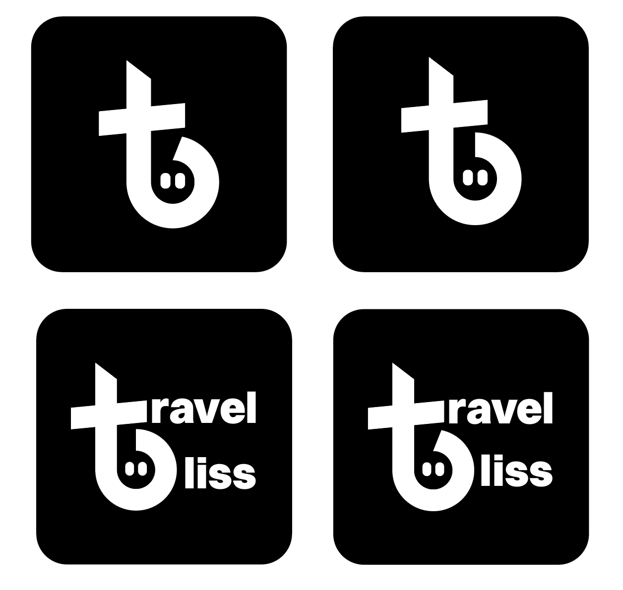
For the second attempt, I aimed to create a more straightforward and bold display by combining the letters 't' and 'b'. This adjustment was made because the first attempt appeared too curly, and the letters were not as distinct.
Figure 9.5 TravelBliss logo
Week 10 - User Test
To ensure that my design structure would be user-friendly, I created a lo-fi prototype and conducted user testing with three friends.
Figure 10.0 Lo-fi Prototype
User testing tasks:
Search for a trip sharing post by another user and view the activities they attended during the trip.
Create an itinerary for an upcoming trip you plan to take.
Share details and experiences from a previous trip you've taken.
User Test Feedback:
User #1 (backpacker)
No major issues with task navigation.
Suggested simplifying the process of posting a post by using a dropdown box for information input.
User #2 (friend group traveller)
Recommended adding sorting options by distance or time for improved user experience.
Expressed interest in the ability to create trip plans, possibly organised by day or activity.
User #3 (family traveller)
Encountered no significant navigation problems.
Indicated a desire for increased familiarity with app navigation.
In conclusion, the user test results show that there are no significant issues with navigation, and users expressed a preference for including visuals to enhance their understanding while using the app.
Week 11 & 12 - Presentation & Visual Design
In week 11, we are also required to conduct a proposal and progress presentation. With that, I worked on preparing the slides for the explanation of my proposed project idea and the progression.
With the wireframes and the selected art direction, I started working on the app's design. This stage involved a lot of trial and error to ensure the visuals look cohesive and align with the chosen art style.
Figure 11.1 Design Progress
Figure 11.2 Design Progress
After receiving feedback, I decided to make some amendments to the logo design and implemented a slanted stroke.
Figure 11.3 Logo Comparison
Figure 11.4 Final Logo
Week 13 - Prototype
After finishing the design, I created the app prototype in Figma.
Figure 13.0 Figma Prototyping Progress
Week 14 & 15 - Animation
I did simple page animation using frame by frame in Figma.
Figure 14.0 Figma Prototyping Progress
In addition, I created graphic animations using Adobe After Effects, and later, I exported them as Lottie files to be integrated into my Figma prototype as GIFs.
Figure 14.1 After Effect Progress
The concept for the logo animation is to convey the underlying idea of the initial letters of TravelBliss, a combination of 't' and 'b' forming a smiley face. The intention is to reveal the smiley first, seamlessly transitioning into the formation of the letters. To emphasize the smiley face, I also incorporated a wink at the end of the animation.
Figure 14.2 Logo Animation
In addition to the logo animation, I also created animations for various graphics on the onboarding pages and for certain celebratory actions.
Figure 14.3 Onboarding Animation #1
Figure 14.4 Onboarding Animation #2
Figure 14.5 Onboarding Animation #3
Figure 14.6 Celebratory Animation
Taking inspiration from Mr. Razif's shared video, I realised that I could enhance my navigation bar by implementing a gradient to differentiate it from the yellow background. This turned the design into a 3D look, adding depth to the navigation bar and making it stand out from a flat design.
Figure 14.7 Navigation Bar (Old Design)
Figure 14.8 Navigation Bar (New Design)
Week 14 & 15 - Exhibition Preparation
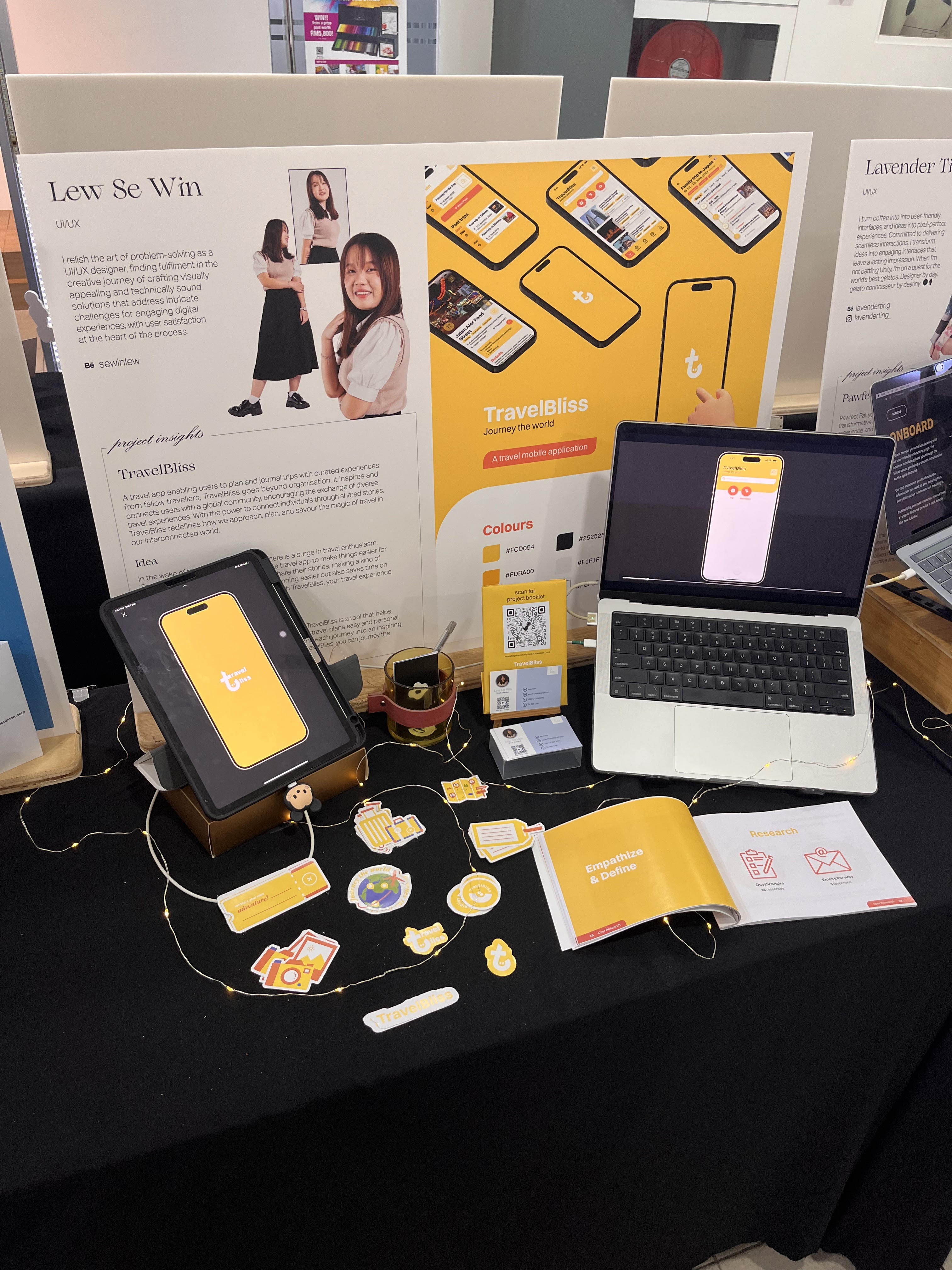
To present my entire project clearly to visitors, I designed a project booklet showcasing the progression of creating the TravelBliss app.
Figure 15.0 Booklet Design Progress
Figure 15.1 Digital Project Booklet
Besides, I designed a few stickers to distribute to visitors, serving as a keepsake and a reminder of the TravelBliss project.
Figure 15.2 Stickers
Figure15.3 Exhibition Set Up
Final Outcome
Project Description:
A travel app enabling users to plan and journal trips with curated experiences from fellow travellers, TravelBliss goes beyond organisation. It inspires and connects users with a global community, encouraging the exchange of diverse travel experiences. With the power to connect individuals through shared stories, TravelBliss redefines how we approach, plan, and savour the magic of travel in our interconnected world.
Project Idea:
In the wake of the lifting of lockdowns, there is a surge in travel enthusiasm. That's why I have the idea for TravelBliss, a travel app to make things easier for travellers. It brings travellers together to share their stories, making a kind of global community. This not only makes planning easier but also saves time on figuring out where to go and what to do. With TravelBliss, your travel experience becomes better and more connected.
Project Objective: This project aims to enhance travel experiences. TravelBliss is a tool that helps you plan trips based on your interests, making the travel plans easy and personal. It not only assists with details but also transforms each journey into an inspiring experience, connecting you with new ideas. With TravelBliss, you can journey the world and every journey is unique and meaningful.
Mr. Asrizal mentioned that the concept of a centralized travel app would not work since each travel app in the market serves a distinct purpose. However, the proposed problem of complex itinerary planning might be viable.
Week 3
Mr. Razif suggested creating a business model canvas to present my idea more clearly and prevent any changes in both the back and front aspects.
Week 4
Mr. Razif suggested that I need to determine how the app will filter and suggest trips to reduce research time during trip planning. Additionally, he mentioned that, as the creator of the company, I should propose initial suggested travel plans to create content before relying on user-generated data. He also emphasised the importance of identifying the key feature of the app first, as it would serve as the foundation for building other features. Research is a crucial part of UX design, and I also need to start thinking about the name of the app. While user personas may share common interests, it's essential to recognise that they may have different purposes for traveling.
Week 5
Mr. Razif suggested that if I couldn't find a travel content creator, I could source the data online. He also suggested that all the research could be done by this week.
Week 6
Mr. Razif suggested that a user journey map could be created task by task for a clearer view, but considering it as a whole is not incorrect either. The logo idea seems more aligned with a culinary or religious theme rather than a travel app logo. Therefore, Mr. Razif recommended considering the creation of a new one. Additionally, I should organise all the research data if I am attending the exhibition to showcase my process and make my idea, along with all the chosen features, more convincing.
Week 7
Mr. Razif suggested having two versions for the activity details page: a public view and a private view. He recommended considering travel documentation in the private view to keep everything in one place.
Week 9
Mr. Razif recommended incorporating a keyword sorting feature, similar to the reviews pages in various apps, into the gathered information page to effectively present and compile all details about the location. He also suggested me to compare the information in TripIt and use it as a reference for my app. I also have to assign few tasks to conduct user testing.
Week 10
Mr. Razif recommended presenting the key aspects concisely within the 10-minute timeframe, focusing on essential elements such as the problem statement, business model canvas, information architecture, and art direction. Additionally, showcasing a few design variations and providing explanations would provide an opportunity to receive feedback during the presentation.
Week 11
After the presentation, Mr. Kannan recommended promptly incorporating the chosen art style into the visual design to ensure its effectiveness. Additionally, he suggested adding a slight slant to the stroke of the combination of letters 't' and 'b' to better convey the dynamic aspect of travel, as a straight orientation may not effectively capture the concept.
Week 12
Mr. Razif suggested that I remove the notes icon if no notes are added to the activity, or alternatively, add a small instruction beside the icon to prevent it from standing awkwardly. Additionally, he pointed out that the white button does not stand out as a button or call to action. To address this, he recommended incorporating secondary colors more prominently to differentiate the buttons from the information. Given that my app contains a lot of information, adding too many visuals might be distracting. Therefore, I could consider using a glass morphism design with a blurred background image to create a fuller appearance. Mr. Razif also advised me to focus on creating a logo animation using After Effects or exploring Lottie creator. Following that, I could delve into designing navigation motion and celebratory call-to-action animations to make my app unique and enhance the user experience.
Week 13
Mr. Razif commented on the UI design, suggesting that the navigation bar could stick to the bottom of the screen for easy accessibility at all times. He also recommended adding spacing between the information page to enhance comfort, and he emphasised not to worry about scrolling. Furthermore, Mr. Razif advised me to prioritise animation over the development of the app due to time constraints.
Week 14
Mr. Razif commented on the logo animation, suggesting that the stroke of the letters 't' and 'b' could transition smoothly from fast to slow as a whole. Additionally, he recommended adding a wink to the eyes to make it easily identifiable as a smiley face.
REFLECTION
Reflecting on the journey of creating TravelBliss, from the initial idea to the final exhibition, has been a transformative and enlightening experience. The project began with a personal passion for travel and a realisation that the existing travel apps did not fully address the complexities of itinerary planning and the desire for meaningful connections among travellers and valuable travel experience.
The brainstorming phase in Week 1 marked the birth of the concept, recognising the challenges faced by travellers in planning and sharing their experiences. The pivot from a centralised travel app to a more focused solution targeting complex itinerary planning highlighted the importance of aligning the project with the actual needs of users.
The research phase deepened my understanding of the market, analyzing competitors like TripAdvisor, Booking.com, Expedia, Trotter it, and TripIt. This phase identified market gaps and refined TravelBliss's value proposition. The creation of a business model canvas clarified project objectives and potential revenue streams. Extensive research in interviews and surveys in subsequent weeks uncovered traveller pain points. The derived user personas and How Might We statements formed the foundation for ideation. Subsequent SWOT analysis and problem statements guided TravelBliss's development, emphasising personalisation, connection, empathy, inspiration, and curation. Ideation resulted in finalizing six main functionalities, ensuring these features directly addressed identified user needs.
The design phase from Week 9 involved researching references for the app's art direction, creating wireframes, and working on the logo design. Feedback from Mr. Razif played a crucial role in refining the design elements, ensuring coherence and user-friendliness. User testing in Week 10 validated the design decisions, and feedback from friends helped uncover areas for improvement. The subsequent weeks involved refining the visual design, creating animations, and preparing for the exhibition. The incorporation of animations, both in the Figma prototype and through Lottie files, added a dynamic and engaging element to the user experience.
Receiving feedback throughout the process, especially from mentors like Mr. Razif and Mr. Kannan, was invaluable. Their insights helped me address design challenges, refine the user interface, and enhance the overall project presentation. In retrospect, the TravelBliss project encapsulates the iterative nature of the design process. It underscores the importance of user-centered design, thorough research, and a willingness to adapt and refine ideas based on feedback. The journey has been a testament to the iterative nature of design thinking and the rewarding outcome of translating a personal passion into a meaningful and user-centric solution.
Regrettably, development had to take a backseat due to an extensive focus on the research phase. I couldn't work on making the app because I spent too much time on researching. I need to manage my time better to finish making the app.
Reflecting on the design exhibition, I realized the significance of effectively communicating my ideas to the public. Initially, I faced challenges as people weren't clear about what I was creating. However, after a few attempts, I'm delighted that most of them could understand the project and the idea I wanted to convey. It was a great experience and a good wrap-up for me as a design student. Cheers!
Lastly, big thanks to my supervisor, Mr. Razif, for helping me a lot during these 15 weeks.


.jpg)


Comments
Post a Comment