Design Research Dissertation / Visual Design Publication Final Dissertation
15.5.2022 - 10.7.2022 (Week 7 - 15)
Lew Se Win / 0347637 / Bachelor of Design (Hons) in Creative Media
Design Research Dissertation
Visual Design Publication Final Dissertation & TURNITIN submission
INSTRUCTIONS
Visual Design Publication
I went to Pinterest to gather some ideas before I began. The first thing that came to my mind was bright gradient colours, because food delivery applications are typically bright and colourful. After that, I also created a mood board in slides to showcase my idea.
Figure 1.0 Mood board, 25.5.2022
In the mood board, the second slide includes the food delivery application elements illustration. My idea was to include some illustrations in my book publication. To avoid copyright issues, I also suggested that I create my own illustration and have the visual I found as a reference. Next, the cover page design reference. My idea was to create a "speedy" feel to the cover page so that it could represent the word "delivery". For the layouts, I wanted to have a clean and neat layout. This is because the dissertation have a lot of words to read. Hence, a clean and neat layout may enable readers to read comfortably and also encourage people who don't like to read to read it easily. The typefaces I decided to use are Helvetica and ITC Garamond. The mixing of san-serif font and serif font would create a more interesting combination of typography. Lastly, the colour chosen was also presented in the slides.
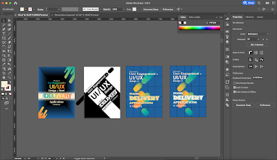
I first started to work with my cover page.
Figure 2.0 Cover Page #1 Progress, 27.5.2022
Figure 2.1 Cover Page #1, 27.5.2022
After the feedback from Dr. Hayati, I decided to create another cover page with lesser gradient.
Figure 2.2 Delivery Word Progress, 30.5.2022
Figure 2.3 Cover Page #2 Progress, 30.5.2022
Figure 2.4 Cover Page #2, 30.5.2022
After creating the cover page, I began working on the layout design with Adobe Indesign. This is where I spend the majority of my time because I have to trial and error to obtain my ideal layout. The running text I decided to use justified text because this will make the layout looks clean and have lesser ragging.
Figure 2.5 Layout Progress, 5.6.2022
Figure 2.6 Layout Progress, 5.6.2022
Figure 2.7 Table & Pie Chart Progress, 9.6.2022
Figure 2.8 Bar Chart Progress, 11.6.2022
After that I transferred the graphs to Adobe InDesign and continue with my layout design.
Figure 2.9 Layout Progress, 11.6.2022
Figure 3.0 Visual Design Publication First Outcome in PDF, 19.6.2022
Figure 3.0 Visual Design Publication First Outcome - Flipbook, 19.6.2022
I was dissatisfied with the outcome because of time constraints. Nonetheless, Dr. Hayati agreed to let us change our graphic design. As a result, I'm going to continue to work on the cover page and some of the layout design.
Figure 4.0 Cover Page #3 Progress, 30.6.2022
Figure 4.1 Cover Page #3 , 30.6.2022
I disagree with the feedback on my cover page #3 because I prefer cover page #3 over cover page #2 but Dr. Hayati is the opposite. However, in order to achieve a better outcome on which both myself and Dr. Hayati can agree, I decided to redesign the cover page once more.
Besides, I revised on some of the layout by adding interfaces of food delivery applications. I also revised the page number design.
Figure 4.4 Page Design Progress, 7.7.2022
Figure 4.5 Page Design Progress, 7.7.2022
Figure 5.0 Final Visual Design Publication Final Dissertation in PDF, 7.7.2022
Figure 5.1 Final Visual Design Publication Final Dissertation - Flipbook, 7.7.2022
Final Dissertation
Following the feedback from Dr. Hayati, I decided to revise my literature review and discussion section.
Figure 6.0 Final Dissertation, 9.7.2022
Figure 6.1 Final Dissertation Turnitin Report (similarity index: 3%), 9.7.2022
FEEDBACK
Week 10
Specific:
Dr. Hayati reminded me to give credit to the images that are taken online. Dr. Hayati then suggested that I use typography that can represent movement. Besides, she said that illustrations already have a lot of colors, and the implementation of the gradient in my chosen colour palette may not look good. At the same time, I can look into a very light color, not necessarily a gradient, that will look a bit more minimalist. My first design (figure 2.1) looks more like an application design. Dr. Hayati also said that the text in InDesign should not cross the page as it will compromise certain parts’ readability and that the title should have a hierarchy.
Week 11
Specific:
Dr. Hayati said that I should link back to the mood board because my design does not really look like my reference. Besides, she said that this cover page (figure 2.4) has a hierarchy compared to the previous one. Next, Dr. Hayati suggested me that don’t modify it from the option 2 cover page and can try different designs.
Week 12
Specific:
Dr. Hayati said that justify text would have "rivers" and unjustify text will have and rhythm. The gradient background looks a bit loose. The cover (figure 2.4) is much better compared to the previous one and very straight forward. Besides, Dr. Hayati reminded me to add some pages after the cover page and before the acknowledgement page. I also have to be careful with the revised white page and try to expedite the last assignment.
Week 14
Specific:
Dr. Hayati said that the "speed" illustration looks like raindrops. Hence, I could just remove it. The option 3 cover page (figure 4.1) looks more like a tech company. Dr. Hayati also suggested changing the background color to a beige color. Besides, my copyright page the font is too big and I should add empty pages before the acknowledgement page. Dr. Hayati also suggested me to can add the interface of FDAs as design elements and reduce the size of taylor’s university logo at the last page.
Week 15
Specific:
Dr. Hayati said that she is ok with the option 4 (figure 4.3) of the cover page.
REFLECTION
Due to time constraints, I was unable to experiment with different book designs. The trial and error process will consume a lot of time. I was unsatisfied with the book's outcome. I believe it could be improved, but I admit that editorial design is my major weakness. As a result, finishing the 200+ page book design is a tough journey for me. However, I still prefer the design part over the writing part of this module.
Besides, Turnitin with only one chance terrified me at first because I'm scared about accidentally plagiarising the work from other scholars. As a consequence, I chose to rephrase some of the sentences before finalising my dissertation. When the report came out, I was quite shocked because it was much lower than I expected. At the same time, I feel relieved as I am finally done with my dissertation.


Comments
Post a Comment